The inspiration came from Chi-Chi: a giant panda that had arrived at
the London Zoo in the year 1961, when WWF was being created.
Aware of the need for a strong, recognisable symbol that would overcome all language barriers, WWF’s founders agreed that the big, furry animal with her appealing, black-patched eyes would make an excellent logo.
British environmentalist and artist Gerald Watterson played a key role in the original panda logo by producing the initial sketches.
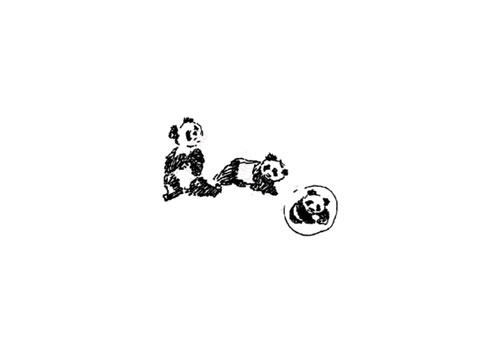
Based on these, Sir Peter Scott, one of the organisation’s founders, drew the first logo, and said at the time:
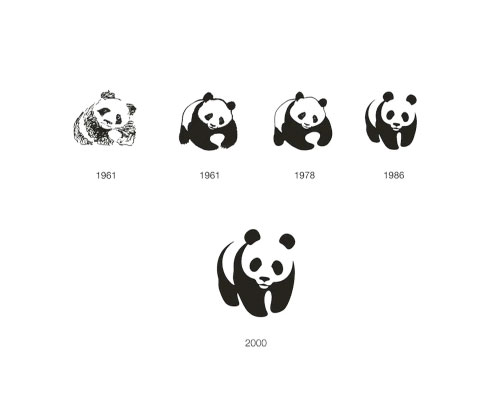
The strongest design improvement came in 1986 when the viewer was left to fill in the gaps in order to complete the symbol.
—
Update: 09 June 2011
Jerry Kuyper added this comment to the thread below:
The firm responsible for the 1986 work was the San Francisco office of Landor. Tom Suiter was the creative director, I was the design director and Jenny Leibundgut was the primary designer.
Prior to our work WWF was using two different pandas, one in the USA (a colder, more geometric version of the 1978 version) and one for the rest of the world.
As I remember, our working attributes were:
- not too cuddly
- not too ferocious
- and most certainly, not about to go extinct
We looked at a dozen ways to add details to the eyes before realizing the obvious — the solid black shapes were the most engaging and open to interpretation.
It is very gratifying to see that the mark has lasted 25 years without the addition of any swooshes, glows or reflections.
—
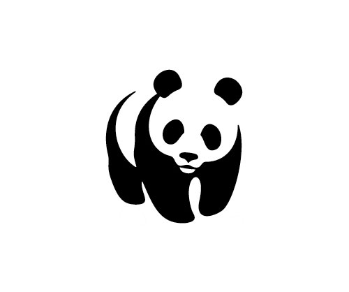
The black-and-white panda has since come to stand as a symbol for the conservation movement as a whole.
Aware of the need for a strong, recognisable symbol that would overcome all language barriers, WWF’s founders agreed that the big, furry animal with her appealing, black-patched eyes would make an excellent logo.
British environmentalist and artist Gerald Watterson played a key role in the original panda logo by producing the initial sketches.

Based on these, Sir Peter Scott, one of the organisation’s founders, drew the first logo, and said at the time:
“We wanted an animal that is beautiful, is endangered, and one loved by many people in the world for its appealing qualities. We also wanted an animal that had an impact in black and white to save money on printing costs.”

The strongest design improvement came in 1986 when the viewer was left to fill in the gaps in order to complete the symbol.
—
Update: 09 June 2011
Jerry Kuyper added this comment to the thread below:
The firm responsible for the 1986 work was the San Francisco office of Landor. Tom Suiter was the creative director, I was the design director and Jenny Leibundgut was the primary designer.
Prior to our work WWF was using two different pandas, one in the USA (a colder, more geometric version of the 1978 version) and one for the rest of the world.
As I remember, our working attributes were:
- not too cuddly
- not too ferocious
- and most certainly, not about to go extinct
We looked at a dozen ways to add details to the eyes before realizing the obvious — the solid black shapes were the most engaging and open to interpretation.
It is very gratifying to see that the mark has lasted 25 years without the addition of any swooshes, glows or reflections.
—
The black-and-white panda has since come to stand as a symbol for the conservation movement as a whole.

No comments:
Post a Comment