Sunday, March 24, 2013

WWF(World Wide Fund for Nature)

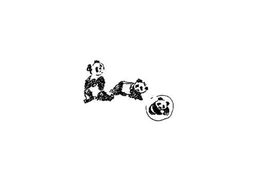
The inspiration came from Chi-Chi: a giant panda that had arrived at the London Zoo in the year 1961, when WWF was being created.
Aware of the need for a strong, recognisable symbol that would overcome all language barriers, WWF’s founders agreed that the big, furry animal with her appealing, black-patched eyes would make an excellent logo.
British environmentalist and artist Gerald Watterson played a key role in the original panda logo by producing the initial sketches.
WWF logo sketches
Based on these, Sir Peter Scott, one of the organisation’s founders, drew the first logo, and said at the time:
“We wanted an animal that is beautiful, is endangered, and one loved by many people in the world for its appealing qualities. We also wanted an animal that had an impact in black and white to save money on printing costs.”
WWF logo sketches
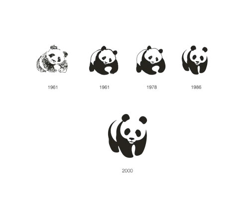
The strongest design improvement came in 1986 when the viewer was left to fill in the gaps in order to complete the symbol.

Update: 09 June 2011
Jerry Kuyper added this comment to the thread below:
The firm responsible for the 1986 work was the San Francisco office of Landor. Tom Suiter was the creative director, I was the design director and Jenny Leibundgut was the primary designer.
Prior to our work WWF was using two different pandas, one in the USA (a colder, more geometric version of the 1978 version) and one for the rest of the world.
As I remember, our working attributes were:
- not too cuddly
- not too ferocious
- and most certainly, not about to go extinct
We looked at a dozen ways to add details to the eyes before realizing the obvious — the solid black shapes were the most engaging and open to interpretation.
It is very gratifying to see that the mark has lasted 25 years without the addition of any swooshes, glows or reflections.

The black-and-white panda has since come to stand as a symbol for the conservation movement as a whole.
WWF logo

Saturday, March 23, 2013

Nike

The Nike "Swoosh'" is a corporate trademark created in 1971 by Carolyn Davidson, while she was a graphic design student at Portland State University. She met Phil Knight while he was teaching accounting classes and she started doing some freelance work for his company, Blue Ribbon Sports (BRS).
For seven years after its founding in 1964, BRS imported Onitsuka Tiger brand running shoes. In 1971, BRS decided to launch its own brand, which would first appear on a soccer cleat called the Nike, manufactured in Mexico. Knight approached Davidson for design ideas for this new brand, and she agreed to provide them. Over the ensuing weeks, she created at least a half-dozen marks and gathered them together to present to Knight, Bob Woodell and Jeff Johnson (two BRS executives) at the company's home office, at the time located in Tigard, Oregon.
They ultimately selected the mark now known globally as the Swoosh. "I don't love it," Knight told her, "but I think it will grow on me." Davidson submitted a bill for US$35 for her work. In September 1983, Knight gave Davidson a golden Swoosh ring with an embedded diamond, and an envelope filled with an undisclosed amount of Nike stock to express his gratitude.

In June 1972, the first running shoes bearing the Swoosh were introduced at the U.S. Track and Field Olympic Trials in Eugene, Oregon. Until 1995, the official corporate logo for Nike featured the name Nike in Futura Bold, all-cap font, cradled within the Swoosh. In 1995, Nike began using the stand-alone Swoosh as its corporate logo, and continues to use it that way today.

BMW Logo : Controversy

BMW LogoBMW Logo
The true meaning of the ‘sky blue and white quartered’ BMW logo is the most controversial issue of the company. According to Dr. Florian Triebel, Executive Board Member of c, “There are two traditions concerning the significance of the BMW logo and trademark, offering two different interpretations of its sky blue and white fields. One interpretation points to a rotating propeller. The other relates the BMW logo to Bavaria as the place where the products are manufactured”. 

The BMW logo consists of a thick black ring encircled by a silver lining. The letters ‘BMW’ are inscribed in a non-serif font in the top half of the black ring.  The gap within the ring is divided into four equal alternative blue and white quarters. The BMW logo, commonly known as "roundel", was created and registered in 1917.

The Controversy:

One version of the ‘sky blue and white checker box’ BMW logo myth connects it with a shining silver/white rotating propeller that the engineers of BMW were working on. The other relates the BMW logo to Bavaria as the place where the products of the company are manufactured and with the national colors of Bavaria (sky blue and white). 


The SHINING PROPELLER Theory:


bmw Logo
BMW's current logo design is said to be evolved from the circular design of a rotating aircraft propeller. The white and blue checker boxes are supposed to be a stylized representation of a white/silver propeller blade spinning against a clear blue sky. The theory is further strengthened with the statement that the image has its origins in World War I in which the Bavarian Luftwaffe flew planes painted in blue and white. It also reflects the origins of BMW as a military aircraft engine maker during WWI and the belief that BMW started as an aero engine manufacturer. According to the company’s journal, “BMW Werkzeitschrift” (1942), the BMW logo emerged when a BMW engineer was testing the company’s first 320 bhp engine. He admired the reflection of the shining disc of the rotating propeller that radiated like an aura of two silver cones. In between the two cones, the blue from the sky shined that made the ‘rotating propeller into four areas of color – silver and blue’. The engineer, who envisioned this image, also saw three letters – B M W – reflected on the propeller. Thus, the BMW logo was born. However, according to a BMW spokesperson, the BMW logo does not symbolize a spinning propeller (although the imagery did appear in post-WWI advertisements). On other note, this statement is considered by many as merely a bogus claim made by the company to give a logical explanation to the public about the BMW logo’s creation. In fact, the first BMW aero-engine test took place in March 1918 – six months after the BMW logo had been created. Additionally, the founding myth of the BMW logo, the propeller, was a component of the engine that was never manufactured by BMW.

Bvarian Flag - BMW Logo ControversyThe BAVARIAN FLAG Theory:

For BMW, it was ‘a happy coincidence’ that the BMW logo symbolized the Bavarian flag colors and represented the company’s origin. When the BMW logo was first created, it was prohibited by the Trademark Act to feature ‘national coats of arms or other symbols of national sovereignty’ in a trademark. This led the BMW marketers to come up with a solution of ‘incorrectly configuring the color elements in the BMW logo from a heraldic perspective’, while also keeping its relationship with Bavaria evident.

BMW

BMW

Everybody knows a BMW automobile when they see one, but most of them have no idea what the logo means. The trademark blue-white BMW logo is meant to symbolize the movement of an aircraft propeller, of white blades cutting through the blue skies. It was first created in 1923, but the logo has pretty much retained its original features other than a few minor modifications to its fonts and colors.


(Current logo)


Wednesday, March 20, 2013

Volkswagen

Volkswagen


The original VW logo from 1939 featured bumped teeth around the circle to make it look like a gear, with long arms rotating around the circle. The arms and gear bumps were eliminated by the time WWII ended and in 2000, VW colored the logo blue and silver.

The Volkswagen logo represents the letter V and W. The logo was the result of a compatition held in the Volkswagen office. The winner was engineer Franz Xaver Reimspieß. For this design he received a one-off payment of 100 Reichmarks.


Current logo:--
 
The name ‘Volkswagen’ means ‘People’s car’ in Germany and this was its initial logo:
This logo was designed by a Porsche employee named Franz Xavier Reimspiess during an office logo design competition. He encircled the letters ‘V’ and ‘W with bold fonts. The circle looked more like a ship’s wheel with fans around. When I first looked at their first logo, the first thing that I thought of was a Pedestal fan or a lower fan to be more precise. The black and white logo remained the identity of Volkswagen until this logo was designed:
 
After the WWII, Britishers took over the company. They renamed the car as Beetle. They changed the logo, though no major changes were made, however, they got rid of the design around the circle which seems to be inspired from the Nazi flag. Surprisingly all the car makers like Fiat and Ford declined to take ‘free control’ of the Volkswagen factory. So, it was returned to the German government, and went on to become one of the world’s bestselling cars ever.
This was a very fine modification in the previous logo; it gave the logo a more elegant and corporate look.

The current logo basically is very similar to the previous one with minute modifications. The major change they’ve done in this logo is its color. 

Sunday, March 17, 2013

Shell Logo : Pecten

An Anglo–Dutch multinational oil and gas company Royal Dutch Shell or known as Shell was founded in 1907 with the merger of two companies   Royal Dutch Petroleum Company and the "Shell" Transport and Trading Company Ltd of the United Kingdom.

The Shell gas station brand logo started out in 1900 as a literal inked clamshell drawing but has gradually become a smooth red and yellow stylized shell.

After the sea shell Pecten maximus ,the shell logo is known as the "pecten" . The basic Idea of logo comes from this particular shell.

The first Shell logo in 1900 is a realistic rendering of a scallop shell. In 1971 Raymond Loewy designed the Shell logo that is still used today. There are two different ideas about the red and yellow Shell colors. The Colors first appeared around 1915 when Shell builds their first service stations in California. A lot of Californians where originally from Spain, the red and yellow would help them create a bond with the brand. A different idea is that the colors where an idea of the Scottish director Graham as they are the basis for the Royal Standard of Scotland.


Current Logo

Saturday, March 16, 2013

Different Species of a Corporate Logo

Wordmark Logo Design:

Wordmark is the most commonly used type of logo designs which is most basically the use of only letters and fonts with less or no graphical representation. This type of logo design can work well for the companies whose name signifies their business.


Lettermark Logo Design:

Lettermark works similar to the Wordmark, the only difference being in the use of only the initials and not the full name. Landmark is completely a typographic mark and uses abbreviations or initials to create monograms and anagrams usually and these letters become a symbol of the company.

 Brandmark Logo Design:

Brandmark logo design is the graphical representation of the working of the company. These are often symbols and are abstract. They are created in a way that complements the basic working of the company, the product or services, and establishes an association with the company. Brandmark uses symbols and graphics in a highly creative way to produce a logo that is easily comprehensible by the target market and imprints that logo on the minds of the intended audience. Companies usually employ high level creative parties to create their logo so that it becomes a trademark of their business and a one major element from which the company can be recognized. Two popular examples of Brandmark logo design is Apple and Nike.

Iconic Logo Design:

Iconic logo designs are also known as combination marks as it combines two major forms of logo designs in one; Brandmark and Wordmark. This combination can be of any sort as the company or the designers think suitable.
This is the most popular style of logo designs as a well used iconic logo can serve the purpose of explaining what the business of the company is about explicitly and can also portray a unique identity. 


Audi


Shape of Audi Logo:
Audi Logo comprises of four 3-dimensional overlapping rings which now appear sharper with a more of a polished chrome look, depict the 1932 merger of Audi with DKW, Horsh and Wanderer, and signifies strength and security.


Audi Logo 1932 

Color of Audi Logo:
The slightly darker colors used in the Audi logo give it a more shinny and defined look. The aluminum silver in the rings represents innovative power and lightweight design, an Audi core competency that set the brand apart.

New Audi Logo:
The new look to the logo is a message by the company to its customers and employees to render more innovative and efficient designs. It is hoped that the new Audi logo, implemented in August 2009, works for the company and further strengthens its bond with its customers.
Old Audi Logo

Copyright


Copyright Logo


The copyright logo (or copyright symbol) is a great example of a professional logo.
Shape of the Copyright logo:
The “c” enclosed in a circle depicts the security it provides to the owner for his original piece of work. This symbol identifies the copyright owner and the year of publication.
Color of the Copyright logo:
The black in the copyright symbol depicts the symbol’s power warning off against the consequences that might result if one disobeys the copyright law.
Font of the Copyright logo:
The bold “c” enhances the power of copyright that it provides to the owner for his work.

Cisco

The original Cisco Systems logo featured a white bridge, made of a variety of different sized lines against a dark background.  The words “Cisco Systems” was above the bridge in red font.  The bridge is fitting, because the company was named “Cisco” after San Francisco, and was named after the founders drove passed the Golden Gate Bridge on their way to register the business.


The name "Cisco" was derived from the city name, San Francisco.
The Cisco Logo was designed under the direction of Gary McCavitt, an employee of Cisco Systems in 1990.  Gary McCavitt was the director of Brand Identity.

The Cisco logo was updated in 1996 by Joe Finocchiaro and Jerry Kuyper.  While keeping the basic intergrity of the logo, the new logo was simple and modern.  In the new Cisco logo, the bridge is the same basic shape, but with fewer, simpler, bolder lines.  The bridge is dark, instead of white.  The red word “CISCO” in all capital letters is below the bridge, and it is on a white background.
logo  Cisco Systems, Inc is a leading consumer electronics and technology company.  It is a worldwide company that is based in San Jose, CA.  It was founded in 1984 by Len Bosack and Sandy Lerner.  In the early years of Cisco Systems, Incorporated, the name “cisco” was not capitalized, because it was an abbreviated version of San Francisco.  In 2011, Cisco Systems, Inc reported a $43.21 billion revenue.

Friday, March 15, 2013

Lamborghini


Lamborghini Logo

The Lamborghini logo stands for the founder’s zodiac sign- the Taurus (a bull). Ferruccio Lamborghini’s love of bullfights is depicted in the logo and Lamborghini car models get their names from famous bulls.

Shape of the Lamborghini Logo:
The logo of Lamborghini represents coat of arms and shows a gold snorting bull on the fore ground. The bull signifies stability, strength and determination. Lamborghini logo has become famous and recognized through out the world.

Color of the Lamborghini Logo:

Amusingly the choice of an animal and the colors used on the Lamborghini logo (gold on a black background, and a charging bull) are suspiciously similar to the Ferrari logo (a black horse on a yellow background). It is believed that this was no accident on the part of Lamborghini, who had a long standing rivalry with Ferrari.

Thursday, March 14, 2013

Google Logo

The name "Google" originated from a misspelling of "googol", which refers to the number represented by a 1 followed by one-hundred zeros. Page and Brin write in their original paper on PageRank:"We chose our systems name, Google, because it is a common spelling of googol, or 10^100 and fits well with our goal of building very large-scale search engines."
Google has had many logos since its renaming from BackRub. The current official Google logo was designed by Ruth Kedar, and is a wordmark based on the Catull typeface.

In 1998, Sergey Brin created a computerized version of the Google letters using the free graphics program GIMP. The typeface was changed and an exclamation mark was added, mimicking the Yahoo! logo.


"There were a lot of different color iterations", says Ruth Kedar, the graphic designer who developed the now-famous logo. "We ended up with the primary colors, but instead of having the pattern go in order, we put a secondary color on the L, which brought back the idea that Google doesn't follow the rules."

In 2010, the Google logo received its first major and permanent overhaul since 1999. The new logo was first tested in November 2009, and was officially launched on May 6, 2010.It utilises an identical typeface to the previous logo, but the "o" is distinctly more orange-colored in place of the previously more yellowish "o", as well as a much more subtle shadow rendered in a different shading style.


Wednesday, March 13, 2013

Bluetooth

The word "Bluetooth" is an anglicized version of the Scandinavian Blåtand/Blåtann, the epithet(glorified nickname) of the tenth-century king Harald I of Denmark and parts of Norway who united dissonant(various) Danish tribes into a single kingdom.


Bluetooth Logo
 The idea of this name was proposed by Jim Kardach who developed a system that would allow mobile phones to communicate with computers (at the time he was reading Frans Gunnar Bengtsson's historical novel The Long Ships about Vikings and king Harald Bluetooth).The implication is that Bluetooth does the same with communications protocols, uniting them into one universal standard.

The Bluetooth logo is a bind rune merging the Younger Futhark runes Runic letter Runic letter ior.svg(Hagall) (ᚼ) and Runic letter Runic letter berkanan.svg  (Bjarkan) (ᛒ), Harald's initials.


Note :

 Runes: Runes are the letters in a set of related alphabets known as runic alphabets, which were used to write various Germanic languages before the adoption of the Latin alphabet and for specialized purposes thereafter. The Scandinavian variants are also known as futhark or fuþark (derived from their first six letters of the alphabet: F, U, Þ, A, R, and K);
bind rune: A bind rune is a ligature (combination) of two or more runes. They are extremely rare in Viking Age inscriptions, but are common in pre-Viking Age (Proto-Norse) and in post-Viking Age (medieval) inscriptions.

Ambigram Logos

An ambigram, also sometimes known as an inversion, is a graphical figure that spells out one or more words not only in its form as presented, but also in another direction or orientation. The text spelled out in the other direction or orientation is often the same, but can also be a different text.


Anouk (2009)
Sun Microsystems (1982)
DeLorean Motor Company (1977)
New Man (1969)
Angels & Demons
Blacksmith
Bombay Stock Exchange
GOES
Illuminati