Thursday, October 10, 2013

The IEEE 'KITE'

IEEE kite
With merger of the Institute of Radio Engineers (IRE, founded 1912) and the American Institute of Electrical Engineers (AIEE, founded 1884) the IEEE(Institute of Electrical and Electronics Engineers) came int existence in 1963.
The IEEE "kite" was created in 1963 with the merger of its two predecessor societies, the AIEE and the IRE. The kite borrowed elements of both organization's logos.The IEEE Master Brand (shown above), consisting of the IEEE logo (kite) followed by the letters I-E-E-E, was adopted by the Board of Directors in Nov 1999.

Wednesday, October 9, 2013

Texas instrument Logo

World's largest producer of digital signal processors (DSPs) and analog semiconductors the Texas Instrument's logo is also as meaningful as its existence.
On first look viewer just see the initails of company name i.e. "ti", but on close look we find some outlined around ti and for your surprise this outline is  nothing but the map of TEXAS (the state of USA).
File:Texas in United States.svg
State Texas mapin Red coloured

Saturday, September 21, 2013

The psychology of logo shapes

The logo shapes used by big brands aren't chosen by chance. 


Be aware that the logo shapes used to portray the most visible brands in our culture have not been chosen by chance - there are some powerful psychological forces at work. In this article we'll take a look at how the informed use of shapes can be used to give your logo the desired resonance.


Our subconscious minds respond in different ways to different logo shapes. Straight lines, circles, curves and jagged edges all imply different meanings and so a skilled logo designer can use shape to infer particular qualities about the brand. Think, for example, of the Nike Swoosh: the combination of curves ending in a sharp point offers a strong suggestion of movement.
Particular logo shapes send out particular messages:
  • Circles, ovals and ellipses tend to project a positive emotional message. Using a circle in a logo can suggest community, friendship, love, relationships and unity. Rings have an implication of marriage and partnership, suggesting stability and endurance.  Curves on any sort tend to be viewed as feminine in nature.
  • Straight edged logo shapes such as squares and triangles suggest stability in more practical terms and can also be used to imply balance. Straight lines and precise logo shapes also impart strength, professionalism and efficiency. However, and particularly if they are combined with colours like blue and grey, they may also appear cold and uninviting. Subverting them with off-kilter positioning or more dynamic colours can counter this problem and conjure up something more interesting.
  • It has also been suggested that triangles have a good association with power, science, religion and law. These tend to be viewed as masculine attributes, so it's no coincidence that triangles feature more prominently in the logos of companies whose products have a masculine bias.
  • Our subconscious minds associate vertical lines with masculinity, strength and aggression, while horizontal lines suggest community, tranquillity and calm.
  • The implications of shape also extend to the typeface chosen. Jagged, angular typefaces may appear as aggressive or dynamic; on the other hand, soft, rounded letters give a youthful appeal. Curved typefaces and cursive scripts tend to appeal more to women, while strong, bold lettering has a more masculine edge.


Monday, September 16, 2013

Burger King

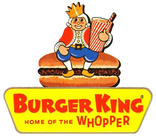
1954-1957

Original BK Logo

1957-1969

Burger King 1966

1969-1994

Original Burger King logo

1994-1999; 1994-2003 (International)

Burger king logo 2
Modified version of the 1969 Burger King logo. Now, the text does not look so cartoony. It was removed in 1999, but it was still used in some areas until 2003.

1999-present

Burger King Logo
In 1999, Burger King "jazzed" up the logo with help by Sterling Brands.

Thursday, September 5, 2013

Terminology related to Symbols

Ensign : 
 An ensign is a national flag when used at sea, in vexillology, or a distinguishing token, emblem, or badge, such as a symbol of office in heraldry. The word has also given rise to the military rank of "ensign", a rank of junior officer once responsible for bearing the ensign.
Roundel: medal(पदक)
 
Insignia
Insignia or insigne pl -nia or -nias (in Latin, insignia is the plural of singular insigne: emblem, symbol, ensign, badge of honor) : a symbol or token of personal power, status or office, or of an official body of government or jurisdiction. An insignia is usually the emblem of a specific or general authority.
Typical examples of insignia are:
  • Badges
  • Cockades
  • Coats of arms and Heraldry
  • Ensigns
  • Flags of a country or state
  • Military aircraft insignia
  • Military rank and unit markings:
  • Other National Emblems
  • Regalia
    • Crowns
    • Sceptres
  • Roundels
  • Seals
  • Shoulder patch, or shoulder sleeve insignia (SSI)
Emblem
An emblem is an abstract or representational pictorial image that represents a concept, like a moral truth, or an allegory, or a person, like a king or saint


Sunday, September 1, 2013

Peugeot

Peugeot

The Peugeot logo has remained pretty consistent for about one-half of a century. Beginning in 1850, the Peugeot lion was present in all of its different logos to date. Although in 1960 and 1965 the logo only features the head of the lion instead of the whole body, the lion was there. The most significant change was the addition of the blue background to the logo in 1998,

(Current logo)

Thursday, August 15, 2013

Bholu : Mascot of Indian railway

 Bholu or Bholu the guard elephant is the mascot of Indian Railways. The mascot, a cartoon of an elephant holding a signal lamp with green light in one hand, was initially designed for Indian Railways' 150th year commemoration events and was unveiled on 16 April 2002 in Bangalore. Later in 2003, Indian Railways decided to permanently retain it as the official mascot.
Bholu is presented as a train guard and he holds a signal lamp with green light in one hand. The green light is the symbol of movement which assures trains and passengers to go ahead with safety and without fear.
He is also the most universally accepted symbol of train running and interaction with passengers. He not only denotes stability but also represents the workforce of the Railways. He is with the train passengers at all times, day and night, and, as train in-charge, is responsible for the safety of a running train and the well-being of passengers. The green light in his hand symbolises movement, the intention to go ahead with safety and positivism.
 Bholu